
The elements of user experience
A framework for the five layers of UX design, from strategy to surface.

People new to the field think UX design means drawing beautiful screens. That’s UI, and it’s the last thing that happens. Under it sits a stack of decisions about who the user is, what the product does, how it holds together, and how a person moves through it. Get those wrong and the interface fails, however beautiful it looks.
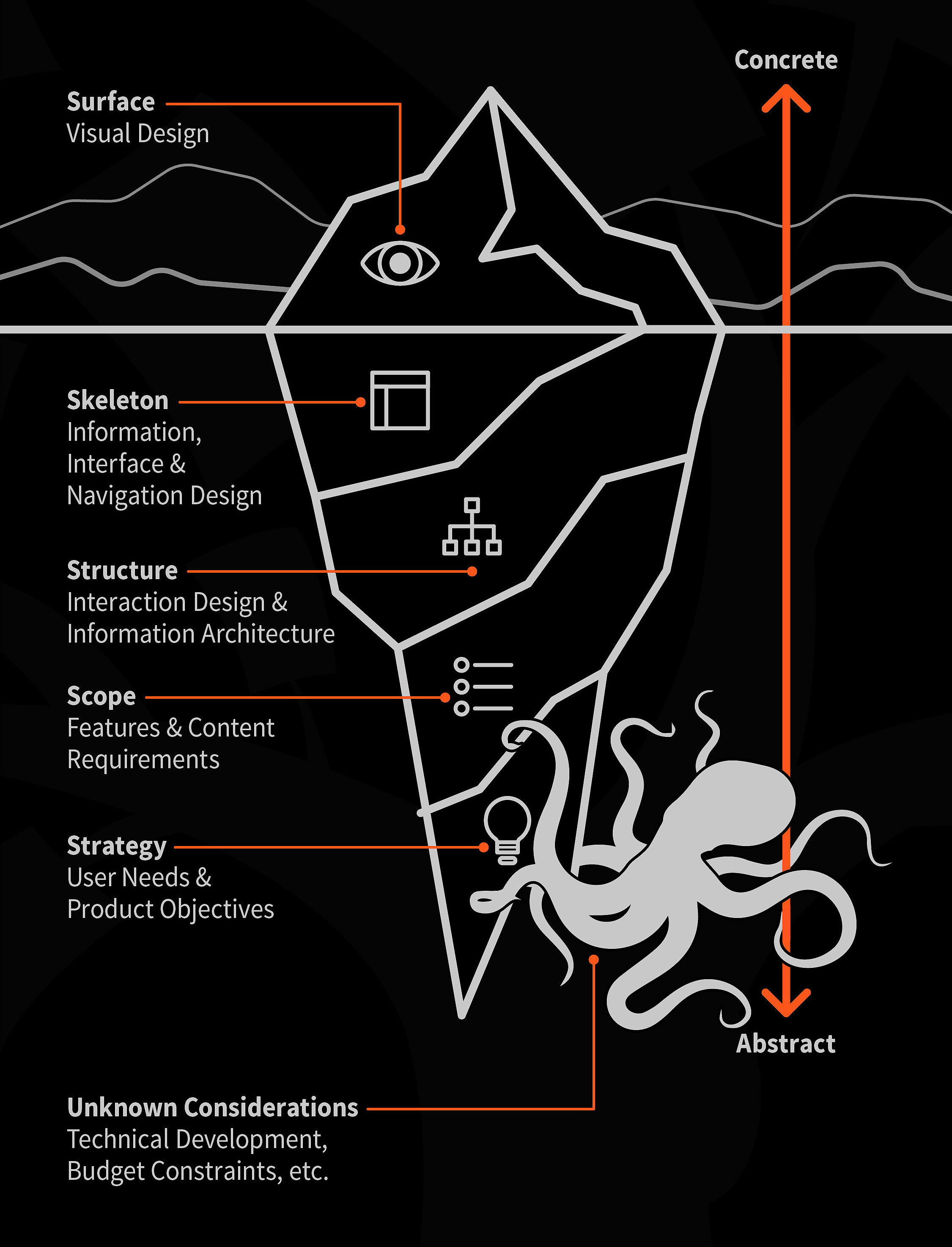
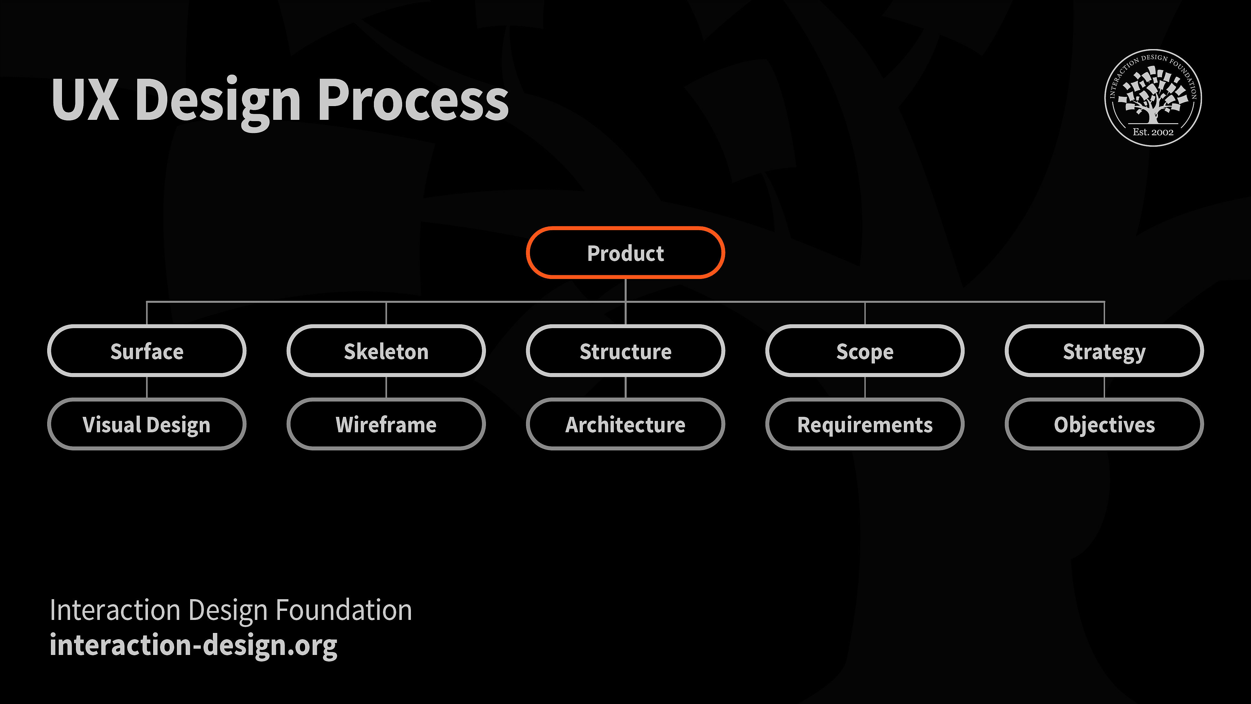
Jesse James Garrett drew a map for this in his book, The Elements of User Experience. He wrote it for websites in 2000, but it holds for any digital product. Five planes, stacked. The bottom plane is the most abstract and the least visible. Each plane up gets more concrete. The top plane is the one the user sees.
He didn’t mean the order as decoration. A decision on a lower plane sets the terms for every plane above it. Choose the wrong problem and no interface can save you. And the stack runs both ways: a usability test on the surface can send you back down to reconsider the scope.
Strategy
Who the user is and what they can’t do today. The team runs interviews and surveys, builds personas and journey maps, and works alongside business stakeholders to decide what the product is for. Freelance writers struggle to keep their books of accounts, and no existing tool fits how they invoice. That gap is the strategy. Everything above this plane serves it.
Scope
Which features earn their place. Once you know the problem, you decide what to build for it and what to leave out. The team picks a freemium invoicing app for those writers, then orders the features into a roadmap so the first release solves the sharpest part of the problem. Designers settle scope with business and engineering, because a feature nobody can build or fund is not in scope.
Structure
How the pieces relate and how a person moves between them. This plane splits in two. Interaction design decides how the product behaves when the user acts. Information architecture decides how content is organized so it can be found. Take invoices: date of issue, due date, payment terms, customer, payment method. Structure is the logic that ties those together and sets the path a user walks to raise one. Information architects often own this work.
Skeleton
Where the structure becomes something you can point at. Wireframes turn the arrangement into labelled boxes and lines: where the button sits, where the total lands, what the user reads first. No color yet, no type. The skeleton fixes placement and priority, and it turns into a prototype so the team can feel how the thing works before anyone polishes it.
Surface
What the user sees and reads. Color, typography, icons, illustration, and the words on the screen: labels, headings, error messages, the empty state. This is the plane most people mistake for the whole job. A cart icon tells the user what a screen does. High contrast makes the text readable. A button that looks like a button on every screen keeps the product legible. The surface is where the two sides of structure rejoin into one experience.
Visual design is one plane, not the discipline
“Problems with visual design can turn users off so quickly that they never discover all the smart choices you made with navigation or interaction design.” Garrett meant it as a warning about the surface. It also tells you how much work sits under the surface, waiting to be thrown away.
Visual design is a specialty on the surface plane. The people who own it are UI designers. When a job posting says UI/UX, the company wants someone who can do research, information architecture, and wireframing as well as visual work. One person can hold all five planes. Most teams split them. A researcher runs interviews while an illustrator builds a palette, and the work gets done in parallel.
The planes are not only design decisions. Scope depends on business and technology: how the product earns revenue, whether it runs third-party ads, whether it integrates with tools the user already uses. Those choices reach all the way up, from the feature set down to a single icon.
A visual designer still needs to understand the planes below. The surface is the first thing users meet, and if they dislike what they see, they never get to the smart work underneath. Once they stay, the look has to match the structure and follow usability principles, or the delight breaks on contact.
The work is never finished
The building metaphor breaks here. A finished building is finished. A product is tested at every plane, forever. The team runs heuristic evaluations and usability tests with real users and keeps asking:
Do we understand the user, and are we solving the right problem? That questions the strategy. Do the features solve it? That questions the scope. Can people actually use them? That questions the structure, skeleton, and surface at once.
The answers spread. A finding on the surface can force a change three planes down. The stack has an order, and the order still bends. UX design is Strategy, Scope, Structure, Skeleton, and Surface, held together and revised against each other until the product works.
Back to basics
I believe the fundamentals now carry more weight. Execution keeps getting cheaper, and what we build and why we build it is still the part worth understanding. Thinking through the experience, solving the right problem, drawing the roadmap, shipping the right features, building the bridge between people and machines, and seeing the whole thing from a plane above. That is the work.
Thanks for reading.
Keep learning and building.
— B
Further reading
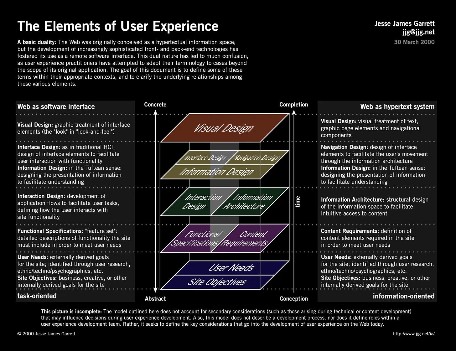
The Elements of User Experience (diagram)
Jesse James Garrett, 2000. The original one-page PDF that started it all, at jjg.net/elements/pdf/elements.pdf. Worth seeing before the book: the whole model on a single sheet.
The Elements of User Experience: User-Centered Design for the Web and Beyond
Jesse James Garrett, 2nd ed., 2010. The source. Short, and the second edition widens it from websites to products.
Don Norman, revised ed., 2013. Where the lower planes come from. Affordances, signifiers, and mental models sit under structure and skeleton.
About Face: The Essentials of Interaction Design
Alan Cooper, Robert Reimann, David Cronin, Christopher Noessel, 4th ed., 2014. Deepens the interaction-design half of the structure plane.
Information Architecture: For the Web and Beyond
Louis Rosenfeld, Peter Morville, Jorge Arango, 4th ed., 2015. The other half of structure, in full.
Design Vault 🗃️
3000+ curated assets in one Notion workspace. UX templates, design systems, accessibility checklists, fonts, tools, books, and 30+ sections more.
Extremely interesting and useful. Thank you